
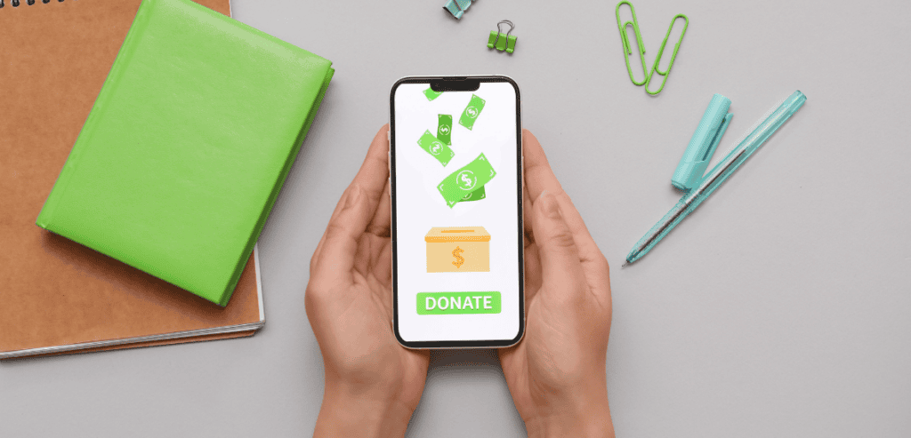
More supporters than ever are reaching your donation page on a phone. Most of them leave without giving. Here’s how to change that.
The average nonprofit loses more than half its potential mobile donors before they ever hit the submit button. That’s not a fundraising problem—it’s a user experience problem. As smartphones become the dominant way people browse, share, and act on causes they care about, mobile giving experience and conversion has quietly become one of the most critical metrics in nonprofit fundraising. Yet most giving pages still look and behave like they were built for a desktop in 2012.
The good news? The friction points are identifiable, the fixes are proven, and the organizations making these changes are seeing measurable lifts in completed gifts. This article walks through exactly where mobile donors drop off, why it happens, and what your nonprofit can do right now to turn mobile visitors into committed supporters.
Why Mobile Donors Abandon Giving Pages
It is important to break down a problem before trying to solve it. By comparing mobile and desktop user behavior, the difference is apparent. Mobile users tend to be more pressed for time, have slower connections, and have a much lower tolerance for friction. They will abandon the interaction when a page loads slowly or when a poorly designed form is presented.
Fundraising professionals describe donation checkout friction as all the steps that get in the way of a donor and their donation. For mobile, friction is exponential. A form that is inconvenient on a laptop is a major headache on a mobile device. Connectivity also impacts load times—a page that loads in seconds on WiFi may take much longer on a mobile network. Multiple page loads compound this problem and result in abandonment.
Page load time is the most common reason a page is abandoned. For nonprofits that rely on capturing donors in an emotionally engaged moment, slow performance is especially costly. When giving is mobile, the donation must happen quickly, or the donor’s intent fades.
The Real Cost of a Broken Mobile Giving Experience
Consider what’s really at play. If a donor clicks on a donation link in an Instagram post, email, or text and arrives on your donation page, they are emotionally charged. The content has just moved them, and they want to help. Their donation intent is real, but it’s also time-bound.
Slow load times, confusing form fields, and unnecessary steps are the biggest culprits. Nonprofit donation page optimization has moved from a technical concern to a strategic and critical aspect of fundraising. The organizations that approach online giving as they would their in-person campaigns are the ones consistently raising the most money.
Year after year, the Fundraising Effectiveness Project tracks donor retention and acquisition. Their data consistently shows a strong increase in mobile donations and a growing critical state of the mobile giving environment for nonprofit fundraising.
Streamline Your Donation Form—Ruthlessly
The biggest leverage for saving donor time is removing the need for a donor profile. There is a gift to be completed, not a profile to create. Donors could change their minds or abandon the donation to focus on something else. Every field you add makes a donation less likely.
Design specifically for mobile. Place labels above fields, not to the left or right. Make tap targets large and comfortable. Ensure error messages appear immediately so donors don’t tap multiple times out of confusion. These design details matter most for converting visitors into donors.
Optimize Payment Processing for the Mobile Moment

Nowhere does friction hurt more than at the payment step. Asking a mobile donor to manually type in a 16-digit card number, expiration date, and CVV is asking too much. Many donors will simply close the tab.
Stripe
Many nonprofits now choose Stripe for payment processing. A major factor in this widespread adoption is Stripe’s support for mobile wallets. When Stripe is integrated, Apple Pay and Google Pay are processed natively on mobile devices. Donations can be made with a simple tap or a face scan, and, importantly, without entering a card number. For spur-of-the-moment mobile donations, mobile wallet support can be a significant factor in whether a donation is completed or the page is abandoned.
Donorbox
Donorbox is built specifically for nonprofit donations and excels at mobile giving. Apple Pay, Google Pay, and Venmo are all included for quick, repeat donations. Integration with your site is straightforward, and embedding is recommended. Donorbox consistently reports low abandonment rates thanks to customized donation forms designed for mobile behavior.
PayPal Giving Fund
An organization should complement its giving options by enabling the PayPal Giving Fund. PayPal is integrated into many mobile devices, meaning millions of people have payment methods already linked. PayPal gives users a seamless way to complete transactions without manually entering card information, which can significantly improve conversion rates for nonprofits.
Ultimately, donors need the payment method they are comfortable with. Limiting payment options to only debit or credit creates unnecessary friction. Offer multiple modern payment methods.
Speed and Technical Performance Are Non-Negotiable
A giving page that takes too long to load is effectively a giving page that doesn’t convert. Loading speed is especially crucial on mobile devices because network conditions vary more frequently and donor patience is more limited. Many nonprofit teams unknowingly inherit slow pages. These slow pages typically have bloated plugins, uncompressed images, or third-party scripts—all of which add to load time without adding donor value.
When assessing giving pages, prioritize the mobile score, not the desktop score. Typical fixes for slow pages include removing unused scripts, enabling browser caching, and compressing images. Even small improvements in load speed can significantly increase mobile donation conversions.
Consider evaluating the platform your giving page is hosted on. If you are evaluating nonprofit CRM and fundraising platforms, migrating to one that prioritizes mobile performance may yield one of the highest returns on the infrastructure investment your organization makes.
Design for the Thumb, Not the Cursor
Designing a mobile interface is distinctly different from designing a desktop interface. On mobile, a user interacts with their thumb, requiring different motions than a mouse and keyboard. This must be considered when designing a mobile giving interface.
Make buttons large enough to tap with confidence. Space buttons far enough apart to avoid accidental taps. Provide suggested donation amounts that reflect what your typical donors give. While suggested amounts may slightly lower the average gift size, they reduce donor hesitation about making a donation at all.
The call-to-action button must be visible without requiring the user to scroll down. The primary action should appear on first load. Mobile interfaces should condense information and prioritize scannability with no horizontal scrolling required. Vertical scrolling only.
Color contrast also matters. Light gray on white may work on desktops, but on mobile screens viewed outdoors, stark, high-contrast colors are needed for readability.
Test, Measure, and Iterate

Optimizing your nonprofit’s giving page should never be a project with a finish line. Excellent organizations with mobile giving are those that constantly run tests, analyze results, and make improvements based on data rather than intuition.
Rather than guessing, organizations can see which layouts, copy, and suggested donation amounts actually work by testing with their own audience. Tailor your giving page based on those results. Over time, small, thoroughly tested changes result in dramatic increases in mobile giving.
Conclusion
Mobile giving is no longer a secondary channel—it is the channel for a growing majority of nonprofit donors. The organizations that treat their mobile giving experience as a strategic priority, not a technical checkbox, are the ones building donor relationships and revenue that scale. Reducing donation checkout friction, improving load performance, simplifying forms, and enabling modern payment methods are not complicated initiatives. They are practical, high-impact steps any nonprofit can take regardless of budget or team size. The donors are already there, phone in hand, ready to give. Your job is simply to make it easy.
Frequently Asked Questions
What is the biggest reason mobile donors abandon nonprofit giving pages?
The most common cause is a combination of slow page load times and overly complex donation forms. When a giving page takes more than three seconds to load or asks for unnecessary information, mobile donors—who are often acting on emotional impulse—lose momentum and leave before completing their gift.
Which payment methods most improve mobile donation conversion?
Digital wallets. Manual card entry is never quick or easy. Digital wallets pre-save payment methods, reducing checkout friction significantly.
How can a nonprofit test whether its giving page is optimized for mobile?
Start with Google’s free Page Speed Insights to assess load performance. You can use Hotjar to review actual visitor journeys on your mobile giving page. This tool also lets you test conversion elements.
Does mobile giving page optimization affect recurring donor acquisition?
Yes. The mobile giving experience is often a donor’s first impression of your nonprofit. First-time givers are significantly more likely to subscribe to future giving after their first gift. Visitors who abandon due to checkout friction cost you not only that single gift but also all the future revenue that the donor would have given.